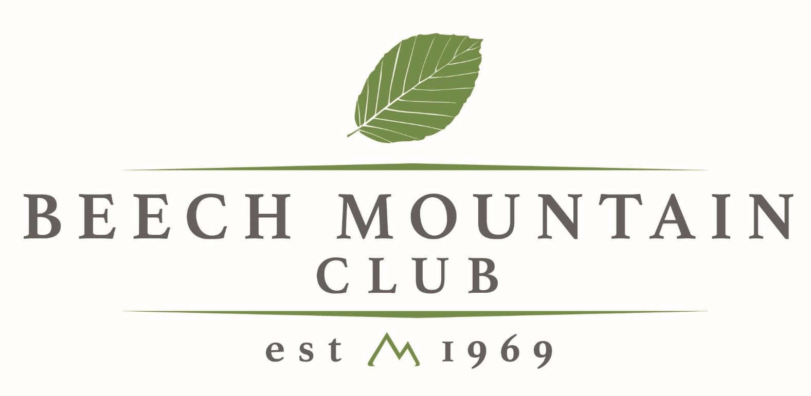
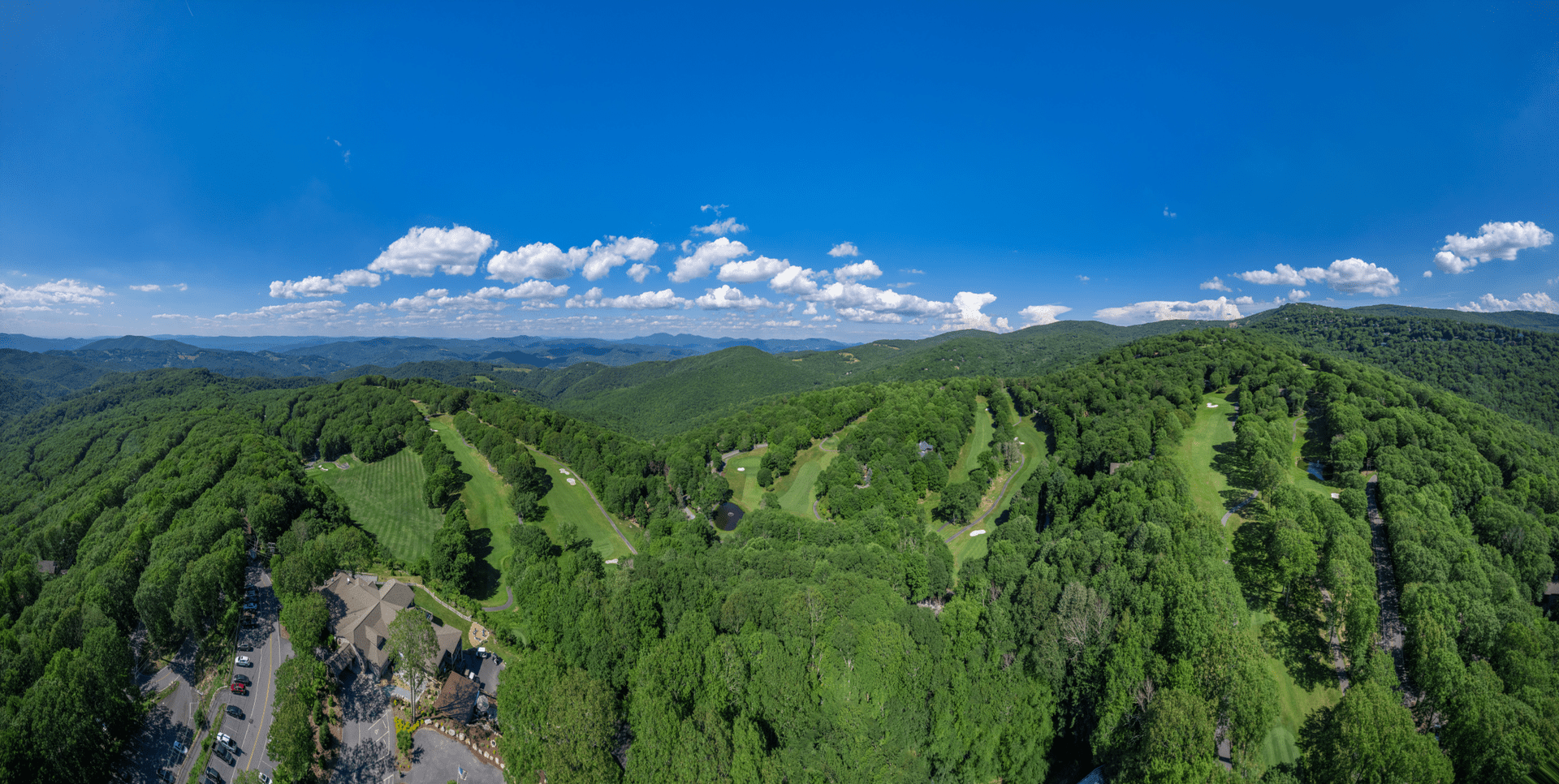
Beech Mountain Club Introduces New Logo
After a couple years of looking at alternative logos for the Club, the Board of Directors recently approved a new official club logo design as well as several variations on the design.
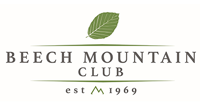
Our main logo will be as follows:
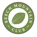
A few of the variations are displayed below:
")
")
You will begin seeing this new logo replace previous logos over the next year or so. The Board approved this logo primarily to represent that the Club is one of the three entities on Beech Mountain and is a friendly but separate and distinct organization from the Town of Beech Mountain and Beech Mountain Resort.
Among the goals for this new logo were to have a clean/modern look/feel, to use a fresh color palate, to provide variations of the logo for applications in digital/print/merchandise, etc. and to honor the history of the Club and Beech Mountain. We feel that this logo checks all those boxes, and we hope the membership will embrace these new designs.
There is one element of the logo, in addition to the Beech tree leaf and mountain peaks, that might beg some questions…that being the decision to use 1969 as the year the club was established. As you can read in the History of Beech Mountain Club HERE, some of the facilities that are now owned and operated by the Beech Mountain Club were initially built and opened in 1969.


